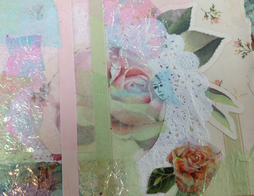
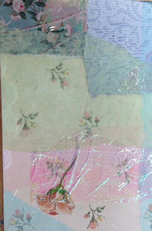
I really enjoyed this project, it was the first time I ventured in mixed media. I got along great with my mentee, Megan, and I had a great time collaborating. I was instantly drawn to the iridescent/transparent plastic. I knew I had to grab it so I raced out of my seat to grab it the moment I had the chance. We went through the fabric books and placed the plastic over each page. We thought it looked nice with a lot of the floral prints so we made that our theme. I was worried Megan
For the mechanical vs. nature project I created "We Should Totally Stab Caesar". A common plot-line in science fiction is a group scientists creating a new piece of technology, such as a robot, and things going out of control. Their creation develops a lust for power, and tries to take over the world. Those who built it up have to find a way to destroy it. Stories like that not only reflect mans desire for power, but mirror the tale of Julius Caesar. Julius Caesar, if you don't already know, was the man who turned Rome into an Empire, and ultimately declared himself the dictator of it. Caesar came from a family with little political influence. He started as a general in the army, and over the years was built up, with the help of his peers, to higher and higher positions. Men of the senate decided he had gone too far, and conspired against him. Around 60 of his men ganged up on him and stabbed him to death. I initially came up with the idea of drawing the fall of Rome with robots as the visigoths, but realized that would be too hard to illustrate in one photo. The idea of Caesar came soon after. At first I was going to draw Caesars assassins as robots. The meaning then would have been something like we've put so much trust in technology, but it's actually harming us. To be honest though, I think "anti-technology" art is lame, boring, and overdone. I think mans lust for power being inherited by one of its creations is a more compelling subject matter. I wanted the composition to look kind of renaissancey, so I got some of my classmates to do a photo shoot. I never realized how fun something like that could be, but it's really cool to actually have real people pose for you instead of just setting things up in your head. I think the photo looks a lot stronger than the drawing because the people take up more space, so next time I have to work on that. I really hope I have the opportunity to do something like this again. I really want to push my compositions this year, and I think this was a step in the right direction.
For my interior spaces project I painted my grandma's kitchen in acrylic paints. I was originally going to do this as one of my summer projects but I got lazy. I'm glad I had the opportunity to still use this photo though. I really liked it and I knew it would make my grandma really happy to know I made art of her. That's mainly the reason why I chose it, but I also liked the perspective of the photo. I've been meaning to get better at perspective for a while, so along with color schemes that's what I mainly focused on in this piece. In my opinion, colors are what makes or breaks a piece. I'm a lover of color, so I often put a lot of it in one piece. It sometimes works in my favor, but I find that in painting it's usually best to keep the palette a little simpler. I try to limit myself to 3 or 4 main colors, but for this piece I decided to go with two. I started of by putting down a wash of the two colors inverted. So the parts that would become pink were teal, and those that would be teal were pink. Pink and teal is my favorite color scheme.I've used pink and teal together along with another color, like yellow, but this was my first time just using those two alone. It was hard at first because my usual painting formula consists of 3 colors. After I put down the first coat of paint (excluding the wash) it looked kind of boring. Nothing stood out, the darks just weren't dark enough. I refused to mix black into it or add another color, so I reused the inverted technique. I began painting my dark areas in the opposite color. When they dried I painted it back over with the color it was really meant to be. It resulted in a much darker value. I loved the result. I think I could've pushed it even more.
Along with color scheme I tried to improve my perspective skills. I can't say I did a great job on that, but I think I did a better job than I would have over the summer. I really needed to make the lines at a more extreme angle. While it may not be lined out perfectly, I think the way that I colored this helps a lot with the perspective though. I wasn't expecting those elements to work hand and in together, but they did and it worked. Overall I liked this piece, and so did my grandma. She got so excited that she had my grandfather print it out and hang it up under another piece I made in 9th grade. This is my everyday object painting. It's my first oil painting, and was done all in palette knife. I came up with a lot of different ideas for this project, but most of them were pretty boring. I thought and thought and thought until the end of class, and then it hit me: bras! Bras are so much fun and I'm actually surprised I haven't seen more art exhibiting them. When I got home I put all of my bras, (and some of my sisters), into a huge pile. I arranged them in a bunch of different ways. When I showed Ms.Rossi the pictures she liked the idea, but suggested putting them in an usual place. I thought it might be funny to put them on a flag pole or something, but I don't have one at home and I'd probably get in a lot of trouble for doing it at school. I decided the best thing to do was just put them in random places all over my house. I put some bras on my fan, on the stairs, in the hallway, on some door knobs. Eventually I put them in the fridge and knew that's the one I had to do. (I really hate showing people my references because they can see how much I messed up, but this one is too good not to show)
The first thing people ask me when they see this is "What did your family think?" When my mom saw me walking down the stairs with heap of bras she of course asked what I was doing: "Where are you going with all those bras?" "Oh, I'm gonna put them in the fridge." "Ok." And that's how it went. I really love this photo and I regret cropping it in the painting. I was just worried the objects would look too small if I did the whole thing. My favorite thing about this piece is that even though the bras are out of place, that's totally what it would look like if someone kept their bras in their fridge. Or at least it looks that way to me. I think I'm probably gonna redo this piece as a drawing sometime, and maybe turn it into a series by using the other photos I took too. Oil was a lot of fun to use, although I think I could've done a better job. It was a good learning experience though, and I learned some techniques that I might use in the future. I love how textured paintings can become with oils, I think they're a good match for me. In the future I'll have to be more careful when using black. I didn't do that patterned bra justice at all, and I think the black outline is the worst thing about it. Maybe I'll fix it when it's dried. I think it was a decent for first try though. I look forward to using more oil paints, and getting a chance to use them on more familiar subject matter. For our first project in AP/Art 4 we had to draw something "reflective". The piece not only had to have reflective objects in it, but had to reflect ourselves. This is mine, it was done in prisma colors on top of colored paper.
When I first started brainstorming I was focusing more on the reflective object than the meaning. I came up with dozens of ideas, but I didn't particularly like any of them. They either seemed too boring, or too impersonal. I came very close to drawing my living room reflected in a big magnifying glass, but the idea still didn't sit right with me. I decided to scroll through my camera roll for inspiration and that's when I found this picture. I really liked the composition in this photo and the lighting. The reason why I like the composition is because the glasses kind of lead your eyes in the direction they're supposed to look. I think I messed up the position of them a little, but it still works. I don't think I did the lighting justice either, so i might go back and darken a few things later on. The lighting in the photo allowed me to play with colors, I also amped it up by saturating it in photoshop so my reference would be really bright. I love using Prismas to exaggerate colors and bring out the life in objects, so they were perfect for this piece. I never imagined retelling this story, especially not on my school art blog, but I guess I kind of have to haha. So right before the summer ended I went to visit Savannah to meet up with my Grandparents. We went out to eat at a really fancy restaurant one night, there must've been something in the water because everyone that worked there was a 10/10. So of course I told my friend about our hot waiter, and of course she wanted a picture. And while I don't normally do that kind of thing, I made an exception since I was leaving town the next day and would probably never see him again. I sneaked a pic and fortunately for me he didn't notice, but just as I was sending it to her he walked behind. He didn't say anything, but I knew he saw it, and he knew I knew he saw it, and it was just really awkward. So along with the reflection of the glasses, it's also reflecting on an embarrassing moment for me. |
AuthorWrite something about yourself. No need to be fancy, just an overview. Archives
May 2016
Categories |