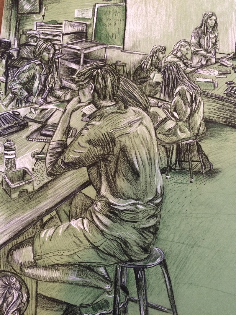
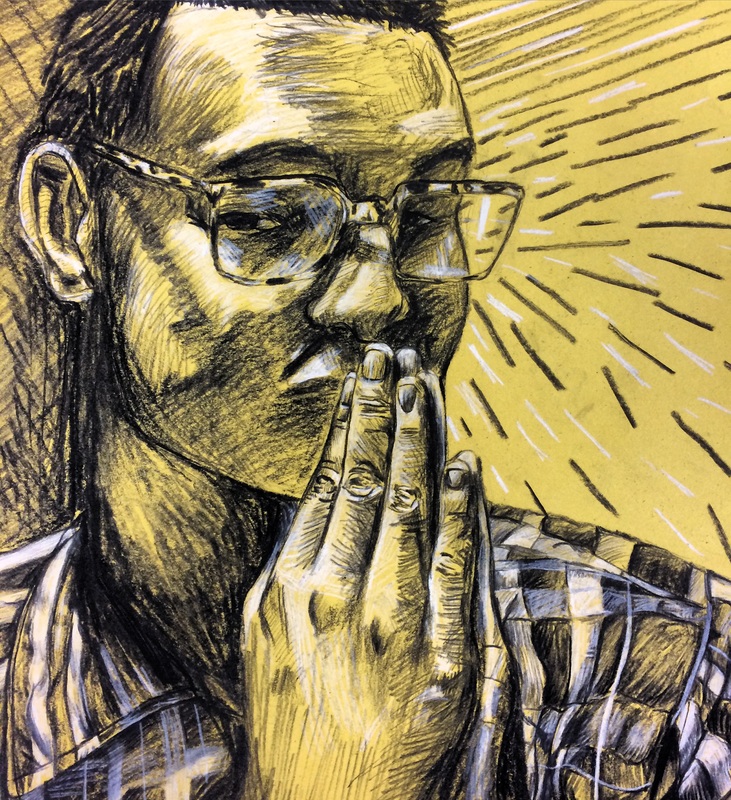
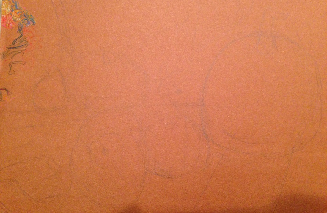
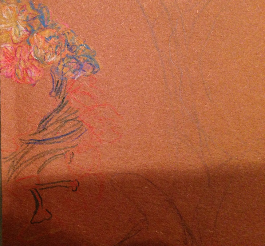
This is my 5th concentration piece. It's a picture of our classroom. I choose this picture because of how busy it is, and it shows our classes dynamic in a way. I also liked the perspective and how there was less in the foreground and more in the background. I implemented chalk pencil pastels for the first time in this piece. I chose a green that was slightly darker than the paper to add more dimension to it. My plan is to keep adding more and more color with each piece from now on. I didn't want my first use of pastels to be jarring so that's another reason I choose green. I hope the color will show a visible evolution throughout my pieces.
0 Comments
This is a drawing of my classmates Hannah, and Abigail. I choose to draw this picture because there's so much going on throughout it. I'm a big fan of Degas and I love his paintings of the unposed ballerinas. That's kind of what I wanted to capture in this piece. I really love when a good composition happens on its own, because I suck at setting things up myself. This was the first time I used textured paper meant for charcoal. I was kind of thrown off at first because I couldn't layer the charcoal the same way I'm used to, but I picked up some new techniques from doing this and I'm happy about it. It really made the whites stand out, and made me more conscious of negative space. I like the way I did Hannah's hair, (the girl with the scissors), and the scarp paper in the foreground. I wish certain parts of it were more defined, but on camera everything looks pretty nice. I loved the dark teal color of the paper, and the texture was definitely interesting to work with.
After deciding to focus on my fellow artists for my concentration I decided to draw a picture of my classmate Brea drawing. I really loved her outfit that day, and her work space was busy enough for it to be an interesting photo. I think the proportions are a little off, but I liked doing another scene. My favorite part is the drawing of the drawing. I left a lot of it blue, and I think that actually made it look a lot better. i also try to let some of the paper stay as it is when I draw, but I always feel like I add too much. I need to perfect my value technique I guess. It's so easy to just cover everything in charcoal, but I need to show more restraint in future drawings. I also need to be more patient when lining my art, because her hands are way too big, and the background seems kind off.
Not the finished piece, but this is my friend Catie. She came into school one day and said "hey, I have this cool picture of myself and I kind of wanna draw it.... well actually I kind of want you to draw it." And, so I did. While working on it I realized that so far all my portraits had been of artists. I decided that my concentration would be of "artists of the future" or something like that. I like it because it's broad, but still has a common theme. I'm thankful for Catie, because without her I probably won't have come up with that idea. Also thankful for the reference photo because I actually really like all of the texture. And it was a lot easier drawing the face with half of it covered. I chose to do it on red paper because the blanket in the photo was red, and I really love the way it looks. I think black and white looks really great with most bright colors, but red is probably my favorite. My favorite part of the piece are her eyes because of they depth I was able to achieve. I also really liked drawing all the squiggles in the scarf, and hope to use more of those lines later on.
I still don't have a set idea for my concentration so I thought I would experiment with something new. For this piece I did a self portrait in charcoal on canvas. I was curious to see how the charcoal would look on that texture. It was slightly different from drawing on paper, but the result wasn't different enough for me to want to do it again. I think this piece is softer than my usual drawings, so if that's your drawing style I'd recommend this technique to you. I still managed to get it pretty sketchy though, but it looks kind of amateurish to me. I probably should've embraced the softness, rather than use my normal style. Another thing about this technique is that it's really hard to erase. You can get it to be a very light gray, but the charcoal never fully comes off. I'm happy I tested it out though, because I've wanted to do this for a while. The next piece I did was a painting: I was hanging out with my friends one night and noticed I really liked the formation they were sitting in. So, I took a picture of it and decided to paint it. I created like 6 different color palettes and let them vote on which one I would use. It was unanimous, they all liked this one the best. When I started to sketch it out on the canvas I realized the dimensions didn't match the reference so I just added those black bars to create a movie like effect. This piece made me consider using "moments of my life" as my concentration, but i probably won't use that. It'd be too boring.
For my landscape I decided to do a scene of a beach. I originally wanted to do a cityscape, but I had no good references so I just chose this. I wanted my colors to be bright and vivid to make it a little more interesting. There were a bunch of people all throughout the photo and I thought it would be too difficult to paint all of them so I decided to start drawing on the piece in pen. I really like the effect of it, and will probably add more throughout it later one.
There weren't many obstacles throughout the piece. I had a hard time deciding what shade of blue I wanted for the sky and the ocean. I intended to make the water greener and the sky bluer, but I ended up swapping the two. It also got a bit harder to get darker with the greens, so I ended up putting purple in the grass areas, and then layer green again on top to create a darker value. This is as far as I've gotten with my pumpkin piece..... but as you can tell from the flowers it's gonna be bangin' 👍👍👍 7 more days. haha
I've drawn so many self portraits so I wanted to do something new for this project. I wanted to do something I've never seen before so I came up with the idea of cutting up a piece of paper and connecting it with wire. I really liked the idea of playing with negative space and I liked that there was a sculptural aspect to it. I started off by printing out my reference and cutting it up in different ways, pasting it on a piece of paper, and drawing what the wires might look like. Then when I started out the final version I drew the outline of the whole face, shaded the parts I wanted to keep, and cut them out with an exacto knife. My next step was to add the wires. I glued the wires on the back of the paper with a hot glue gun. I used thick paper so the glue didn't warp it. My biggest obstacle was creating a background for it. As of now it's pasted on a piece of cardboard, with some wires attached to it, and a photograph cut out, but it looks kind of cheap to me. I'm probably gonna take it off of that and find another background because I think it just takes away from the piece, and makes it look kind of childish. While I was still adding wires I put it on top of a piece of cardboard that i've been using as a palette for the last year and it looked really nice. I might try and replicate the way this looks on a canvas because I think it looks a lot better than the first one. I'm still figuring it out, but I think I'll get there soon.
I have three pets so it was kind of hard to pick one of them for the portrait, but I decided to do my dog, Puff. I chose this picture because I liked the lines in the pillows. I used water color and pen to create this. The last time I used water color in a piece was the summer before my junior year. I don't have much experience with it, but I love the way water color looks so I wanted to get better at it. Unfortunately I don't think I did the medium justice with this piece. In retrospect I probably should've drawn it or used acrylic. Most water color pieces I like are landscapes or portraits with a lot of varying colors. The best thing about this piece is the pen work in my opinion. This was how it looked before I added the pen work. I prefer the pillows without the lines, but Puff looks way better in the top picture. I have a lot to learn about water colors. I think my biggest struggle was getting the color I desired on the paper. It looks kind of washed out to me and not in the good ways. As I layered the paper got kind of gross, especially in the top right corner. I'm going to continue practicing water color at home and hopefully I'll get good enough to do another pieced for class.
|
AuthorWrite something about yourself. No need to be fancy, just an overview. Archives
May 2016
Categories |