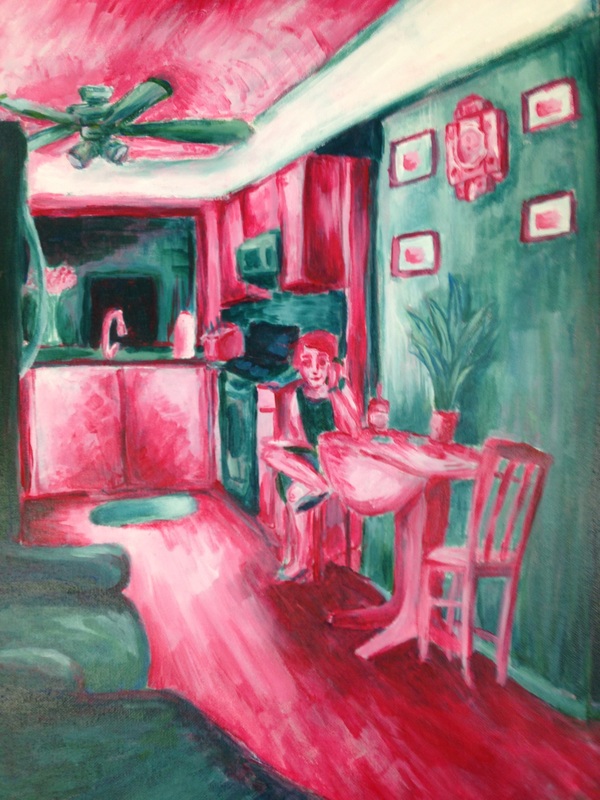
For my interior spaces project I painted my grandma's kitchen in acrylic paints. I was originally going to do this as one of my summer projects but I got lazy. I'm glad I had the opportunity to still use this photo though. I really liked it and I knew it would make my grandma really happy to know I made art of her. That's mainly the reason why I chose it, but I also liked the perspective of the photo. I've been meaning to get better at perspective for a while, so along with color schemes that's what I mainly focused on in this piece.
In my opinion, colors are what makes or breaks a piece. I'm a lover of color, so I often put a lot of it in one piece. It sometimes works in my favor, but I find that in painting it's usually best to keep the palette a little simpler. I try to limit myself to 3 or 4 main colors, but for this piece I decided to go with two. I started of by putting down a wash of the two colors inverted. So the parts that would become pink were teal, and those that would be teal were pink.
In my opinion, colors are what makes or breaks a piece. I'm a lover of color, so I often put a lot of it in one piece. It sometimes works in my favor, but I find that in painting it's usually best to keep the palette a little simpler. I try to limit myself to 3 or 4 main colors, but for this piece I decided to go with two. I started of by putting down a wash of the two colors inverted. So the parts that would become pink were teal, and those that would be teal were pink.
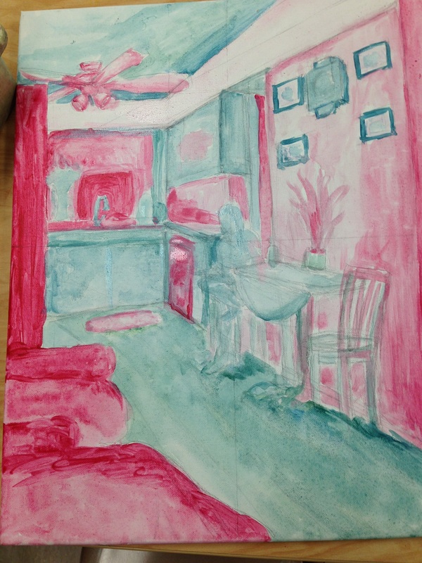
Pink and teal is my favorite color scheme.I've used pink and teal together along with another color, like yellow, but this was my first time just using those two alone. It was hard at first because my usual painting formula consists of 3 colors. After I put down the first coat of paint (excluding the wash) it looked kind of boring. Nothing stood out, the darks just weren't dark enough. I refused to mix black into it or add another color, so I reused the inverted technique. I began painting my dark areas in the opposite color. When they dried I painted it back over with the color it was really meant to be. It resulted in a much darker value. I loved the result. I think I could've pushed it even more.
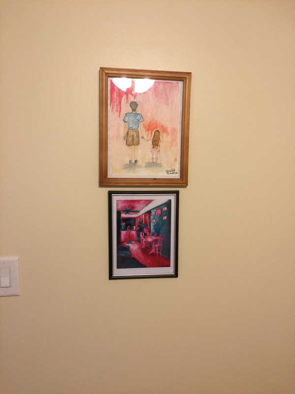
Along with color scheme I tried to improve my perspective skills. I can't say I did a great job on that, but I think I did a better job than I would have over the summer. I really needed to make the lines at a more extreme angle. While it may not be lined out perfectly, I think the way that I colored this helps a lot with the perspective though. I wasn't expecting those elements to work hand and in together, but they did and it worked. Overall I liked this piece, and so did my grandma. She got so excited that she had my grandfather print it out and hang it up under another piece I made in 9th grade.
Along with color scheme I tried to improve my perspective skills. I can't say I did a great job on that, but I think I did a better job than I would have over the summer. I really needed to make the lines at a more extreme angle. While it may not be lined out perfectly, I think the way that I colored this helps a lot with the perspective though. I wasn't expecting those elements to work hand and in together, but they did and it worked. Overall I liked this piece, and so did my grandma. She got so excited that she had my grandfather print it out and hang it up under another piece I made in 9th grade.
 RSS Feed
