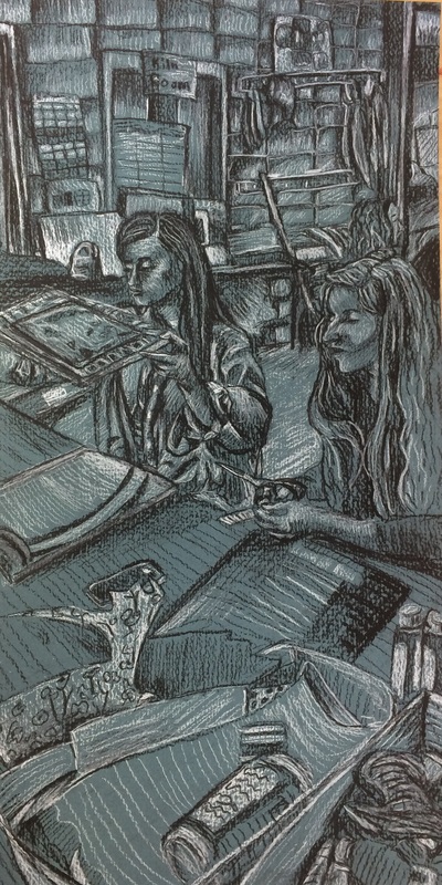
This is a drawing of my classmates Hannah, and Abigail. I choose to draw this picture because there's so much going on throughout it. I'm a big fan of Degas and I love his paintings of the unposed ballerinas. That's kind of what I wanted to capture in this piece. I really love when a good composition happens on its own, because I suck at setting things up myself. This was the first time I used textured paper meant for charcoal. I was kind of thrown off at first because I couldn't layer the charcoal the same way I'm used to, but I picked up some new techniques from doing this and I'm happy about it. It really made the whites stand out, and made me more conscious of negative space. I like the way I did Hannah's hair, (the girl with the scissors), and the scarp paper in the foreground. I wish certain parts of it were more defined, but on camera everything looks pretty nice. I loved the dark teal color of the paper, and the texture was definitely interesting to work with.
After deciding to focus on my fellow artists for my concentration I decided to draw a picture of my classmate Brea drawing. I really loved her outfit that day, and her work space was busy enough for it to be an interesting photo. I think the proportions are a little off, but I liked doing another scene. My favorite part is the drawing of the drawing. I left a lot of it blue, and I think that actually made it look a lot better. i also try to let some of the paper stay as it is when I draw, but I always feel like I add too much. I need to perfect my value technique I guess. It's so easy to just cover everything in charcoal, but I need to show more restraint in future drawings. I also need to be more patient when lining my art, because her hands are way too big, and the background seems kind off.
Not the finished piece, but this is my friend Catie. She came into school one day and said "hey, I have this cool picture of myself and I kind of wanna draw it.... well actually I kind of want you to draw it." And, so I did. While working on it I realized that so far all my portraits had been of artists. I decided that my concentration would be of "artists of the future" or something like that. I like it because it's broad, but still has a common theme. I'm thankful for Catie, because without her I probably won't have come up with that idea. Also thankful for the reference photo because I actually really like all of the texture. And it was a lot easier drawing the face with half of it covered. I chose to do it on red paper because the blanket in the photo was red, and I really love the way it looks. I think black and white looks really great with most bright colors, but red is probably my favorite. My favorite part of the piece are her eyes because of they depth I was able to achieve. I also really liked drawing all the squiggles in the scarf, and hope to use more of those lines later on.
|
AuthorWrite something about yourself. No need to be fancy, just an overview. Archives
May 2016
Categories |